Custom Messages
Overview
Custom Messages let Team and Enterprise tenants design the in-app messages shown when a detection control uses the Message response action. They turn a security event into a clear user experience: explain what happened, tell the user what to do next, and keep the message aligned with your app's brand and support process.
Use custom messages for recoverable or explainable conditions such as device policy requirements, app update guidance, unsupported environments, or support-directed remediation. For critical threats where the app must stop immediately, validate the wording carefully before promoting it to Production.

Message Lifecycle
| Step | What happens |
|---|---|
| Design | Create the HTML/CSS template and preview it on small and large screens. |
| Configure | Select the Message response on the relevant detection control and set title, body, button labels, and actions. |
| Validate | Build or update the target environment and test the message on a physical device. |
| Promote | Move the approved template and control configuration through Staging to Production. |
| Monitor | Review device logs, support tickets, and user outcomes after rollout. |
Message Designer
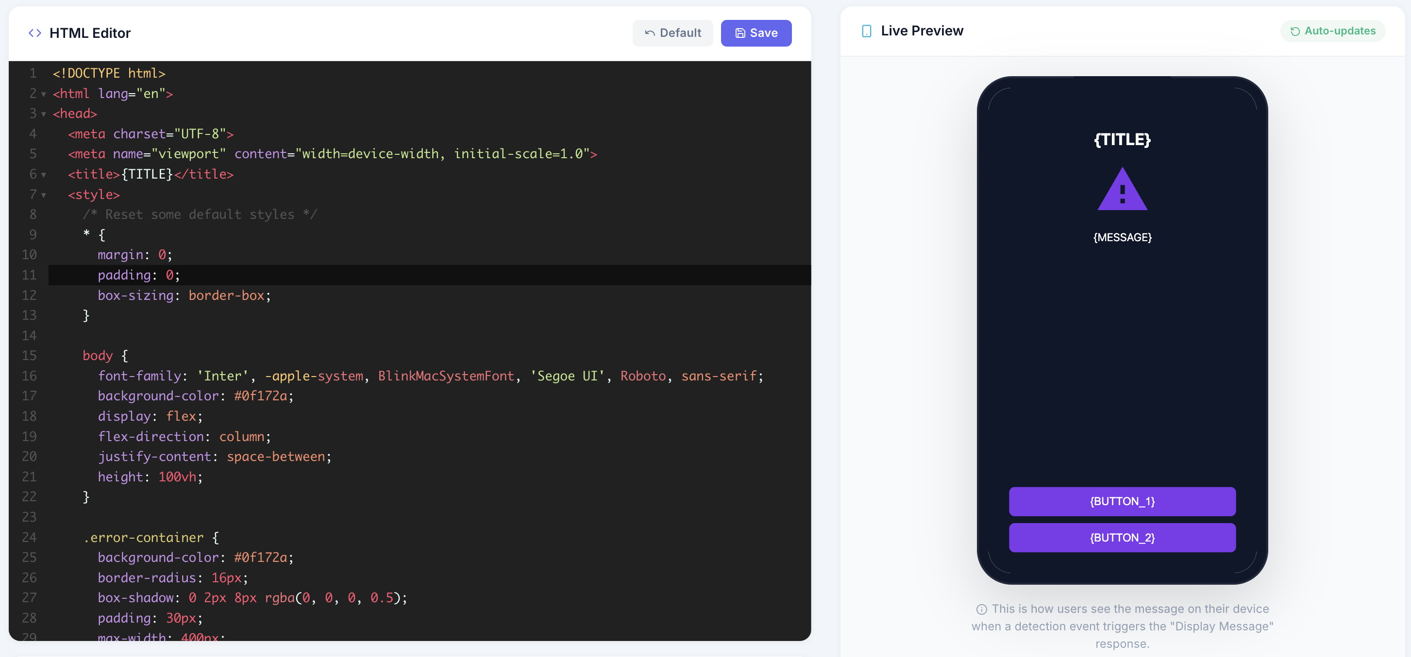
Editor
The portal includes a message editor with HTML/CSS syntax highlighting, line numbers, code folding, bracket matching, live preview, and responsive layout support. You can design a complete message template without leaving the portal.
Access The Editor
- Open Message Design in the sidebar.
- Review the current template or start from the default template.
- Edit HTML and CSS directly.
- Use the preview to check layout and copy.
- Click Save to store the template.
- Test in Development before promoting to Staging or Production.
Template Format
Custom messages are HTML documents rendered inside an in-app overlay. Keep templates self-contained: inline the CSS you need, avoid external assets, and ensure the layout works on small phones as well as larger screens.
Template Size Limit
Custom message templates can be up to 5 MB (5,242,880 UTF-8 bytes) per configuration version. The limit applies to the saved HTML template string, including inline CSS, markup, and placeholder text.
Response titles, body text, button labels, and complete control configuration have separate limits. See Message And Configuration Limits.
Template Placeholders
The following placeholders are substituted at runtime when the message is displayed:
| Placeholder | Replaced With | Description |
|---|---|---|
{TITLE} | Title text | The alert title configured for the detection control |
{MESSAGE} | Message body | The body text configured for the detection control |
{BUTTON_1} | Button 1 label | Text for the first action button |
{BUTTON_2} | Button 2 label | Text for the second action button |
{ACTION_1} | JavaScript handler | Action triggered when button 1 is clicked |
{ACTION_2} | JavaScript handler | Action triggered when button 2 is clicked |
{BUTTON_1_VISIBILITY} | "" or "hidden" | Controls visibility of button 1 |
{BUTTON_2_VISIBILITY} | "" or "hidden" | Controls visibility of button 2 |
Default Template
The default template provides a complete responsive layout with a title, body text, and action buttons. Use it as a safe starting point, then adjust colors, typography, spacing, and support copy to match your application. You can always revert back to the default.
Multi-language Support
Message responses within controls support dynamic localization based on the user's device locale settings.
Important: For multi-language to work, the
<default>tag must be present, and the formatting must be strictly preserved.
If the multi-language tags are not used, or if the formatting is incorrect, the system will fall back to displaying the raw text exactly as entered.
Format:
<default>This is the default title
<en_US>This is the English title
<ja_JP>これはタイトルです
Button Actions
Button actions are JavaScript handlers injected at runtime. The available actions determined by the options you set on the control.
Each button can have a different action, allowing patterns like "Exit" + "Learn More" or "OK".
For strict blocking flows, use you can use a message to provide context before the user loses access. For recoverable flows, prefer wording that gives a clear next step such as updating the app, disabling a policy-violating environment, or contacting support.
Version Management
Custom messages follow the same environment model as security controls:
| Environment | Purpose |
|---|---|
| Development | Test new message designs safely |
| Staging | Validate with QA before production |
| Production | Live message shown to end users |
Promotion
Promote message changes through environments just like security configurations: Development -> Staging -> Production. Treat copy, links, and button actions as release-impacting changes.
Activation
- Save your custom message template in the editor.
- Set Enable Custom Messages to Enabled.
- Configure a detection control with the Message response action.
- Build or update the relevant environment according to your rollout model.
- Test the message on a physical device before promoting it.
If no custom message is active, detection controls using the Message action use the default message prompt of the mobile OS.
Live Push (Enterprise)
Enterprise tenants can push supported custom message updates to already-deployed apps without requiring a rebuild if live configuration was enabled before release. This is useful for updating remediation wording, support links, compliance instructions, or urgent guidance.
Design Best Practices
- Keep the message short, specific, and actionable.
- State what the user can do next: update the app, contact support, use a compliant device, or retry in a trusted environment.
- Avoid vague security language that makes users feel blamed or confused.
- Use responsive CSS and test on small screens.
- Avoid external images, fonts, scripts, and remote dependencies so the message works offline.
- Use accessible contrast, visible focus states, and plain language.
- Use multiple languages if your app supports multiple regions.
- Validate links, button actions, and strict blocking behavior in Development before promotion.
Message Copy Checklist
| Copy element | Recommendation |
|---|---|
| Title | Describe the issue in user language, such as Action Required or Unsupported Device State. |
| Body | Explain the impact and the next step without exposing internal detection details. |
| Primary button | Use a clear verb such as Update App, Contact Support, Learn More, or Close App. |
| Support link | Point to a stable support or help page your team controls. |
| Tone | Keep it calm, direct, and consistent with your app's normal support voice. |